ROLE
Product Designer
Interaction design & prototyping, accessibility-informed visual design, usability testing
COMPANY
Indiana Institute on Disability and Community
INDUSTRY
Mobile AR
OVERVIEW
For someone on the autism spectrum, navigating an unfamiliar environment can be genuinely overwhelming — and most navigation apps make it worse, each one assuming a single way of processing space: abstract directions, dense visuals, constant rerouting. ClearPath is a research-driven exploration of how accessibility-first design and augmented reality can make wayfinding feel safe, predictable, and confidence-building instead.
Due to NDA, product names and visuals are abstracted. Contact me to view the presentation deck.
GLIMPSE
Play the video to watch the showcase video.
PROBLEM
Abstract cues like cardinal directions and distances, too much information at once, and unexpected route changes all make wayfinding hard — and that difficulty quietly shrinks independence, keeping people from venturing into public spaces alone. As designer-researcher Julie Irish has noted, autistic adults often "have a lot of fear of getting lost," because they don't experience space the way neurotypical people do.
"Adults with autism have talked or written about how they have a lot of fear of getting lost...They don’t see the world in the same way that other people do. That can make navigation hard." - Julie Irish, an interior designer and Ph.D. graduate of the University of Minnesota’s College of Design
STAKES
The need is large and growing, and the consequences of getting it wrong are serious. Research also shows spatial navigation is central to independent daily living — exactly the area where this group struggles most, which is what makes an intervention here matter.
REFRAME
Mainstream tools are built around a neurotypical cognitive model, so the opportunity wasn't a prettier map — it was stripping out the abstraction that made existing tools unusable for our users. That framed our challenge: reduce cognitive and sensory overload, support consistency and predictability, and help users build confidence over time.
MY ROLE

PRINCIPLES
1. Reduce abstraction
Anchor visual and audio cues to the real environment instead of a top-down map.
2. Chunk information
Deliver guidance in small, sequential steps so it never overstimulates.
3. Prioritize predictability over flexibility
Favor consistent, repeatable flows that support memory and routine.
Two values sat under every decision: independence and consistency.
ACCESSIBILITY
High-contrast combinations (4.5:1 and up), calm muted palettes and glassmorphism to cut sensory strain, minimal on-screen clutter, and optional sensory toggles so users tune visual and audio intensity to themselves. This wasn't a formal WCAG audit — I used the accessibility guidelines as design heuristics throughout.

SOLUTION

USER TESTING
Alternate routes. Users wanted control over how they got somewhere, not just the fastest line — so I added a choice of routes ranked by how crowded each one is, with crowd-by-hour data and the option to schedule for a calmer time. Control lowers anxiety.
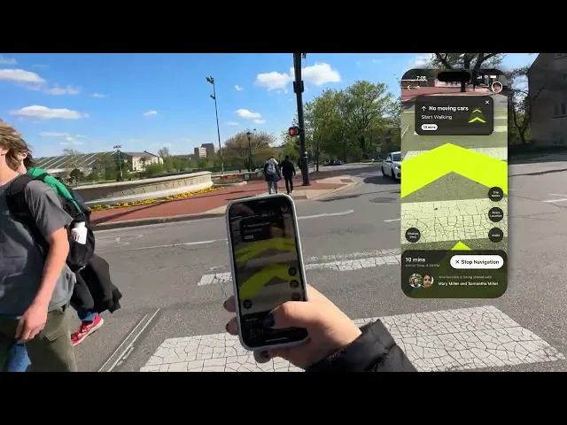
A calmer navigation view. The live AR view carried too much visual noise from surrounding buildings, so I added a toggle that defocuses the environment into a monotone overlay — keeping the path sharp and everything else quiet, so the user can lock onto the one thing that matters.

IMPACT
Evaluated through usability testing with individuals on the autism spectrum and expert consultation, 70% reported increased confidence navigating unfamiliar environments with AR guidance. Participants hesitated less than with traditional maps, consistently preferred route-based AR cues and landmarks over abstract directions, and responded well to the choices around consistency, reduced sensory load, and predictability.
Hear it from one of the participant:
“You’re telling me, this app right here can like tell when there’s no cars and tell you to go? This is like something out of Harry Potter! Wow this is cool!”
— Test participant
REFLECTION
This project reframed accessibility for me: it isn't a layer you add at the end, it's friction you take away. Every choice — less on screen, fewer surprises, cues anchored to the real world — started in research and got pressure-tested by the people it was for. Designing this slowly and this deliberately, with every decision having to earn its place against evidence and feedback, is the discipline I carry into everything since.